Today’s Ask SkyVerge question is from Harshad:
The “My Account” page used to display the login and register forms side by side, but now that I switched to Storefront and updated WooCommerce they are below each other, taking up a lot of space on the page. Can the Storefront My Account page be changed?
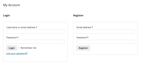
If you use WooCommerce in a default theme, like TwentyTwelve, you’ll see that the “My Account” page layout is in two columns, side-by-side (for non-logged in users).
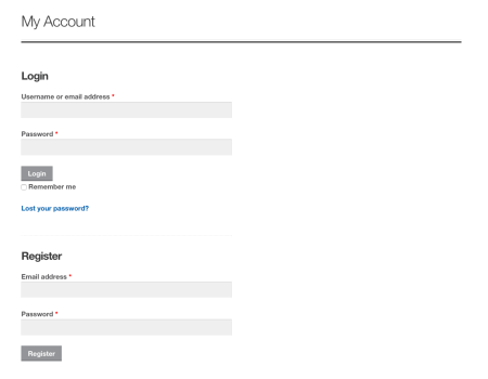
If you use Storefront, your account page may look like this instead:
However, we can change it to a two column layout pretty simply! We’ll just need a bit of CSS to change this layout. We’ll only apply it if the screen is larger than 768px, as screens smaller than this should use a one-column layout to ensure the forms are large enough to use.
You can add this to your child theme’s stylesheet or your custom CSS plugin.
@media screen and (min-width: 768px) {
    #customer_login.col2-set {
      width: 100%;
    }

    #customer_login .col-1 {
      width: 47%;
      border-bottom: none !important;
      float: left;
      display: inline-block;
      padding-right: 3%;
      margin-right: 3%;
      border-right: 1px solid rgba(0,0,0,.1);
    }

    #customer_login .col-2 {
      width: 47%;
      display: inline-block;
    }

    #customer_login .col-1 label.inline {
      display: inline-block;
      margin-left: 20px;
    }
}
Now that we’ve adjusted these columns, we’ll have a “My Account” page that displays the login and register forms side-by-side:
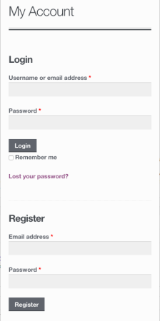
On a mobile layout, these columns will stack again:
Be sure to make these changes in a child theme rather than the parent theme so you don’t lose them when you update Storefront.


